The company
Red Star Education provides financial courses and workshops to help upcoming and aspiring football players as well as within the community. The company is owned by Kristen Cunliffe whom I have known for over fifteen years and in this time I have had the pleasure of creating and maintaining her website along with her main website, Red Star Wealth.
The aim of Red Star Education as an organisation is to ensure that all young people have the knowledge and knowhow to help them tackle financial situations in their future lives.
Kristen has been looking to expand her website for some time as previously the main focus was on educating young footballers within football clubs. Most recently she has been looking to expand even further to add other areas of expertise within the financial education setting.

The Requirements
- Easily access all three sides of the business from the homepage.
- Keep the existing layout and homepage for consistency across the business.
- It must be easy to use and each section or the business must have a page explaining what they do.
- The website must work well on both desktop and mobile.
- Use the brand colours and typography for brand consistency across the Red Star website.
- Include a blog so that members of her team can all add new articles as and when they wish.
- Use video and images to achieve a modern looking and engaging website.


My process
Kristen wanted me to find a way of showing all sides of her business direct on her homepage which would easily allow people to choose which part of the business they wanted to learn more about.
The first thing that I did was to draw inspiration from websites, such as siteinspire. This gives me an idea of the latest trends and styles and I use this as a starting point to begin the creative process of designing to the clients specification.
Once the research phase is complete I spend time creating a mood board before then beginning to sketch out different layouts using a traditional method of paper and pen. Each time I usually improve on the previous sketch until I have found a layout that I am happy with and fulfils the initial brief.
I then open up Sketch, which is my favoured editing software and started to put together some low fidelity designs that I could show to Kristen. Once I had done a few different mock ups I passed these on to Kristen to obtain her feedback. Following her positive feedback, I was able to add the finishing touches to the designs and then move on to building the website using HTML and Sass/CSS.
For the rest of the website I was able to keep the existing layout, which I then duplicated for each side of the business. I then finally sent the final HTML and CSS over to Kristen to approve before I put the website live.
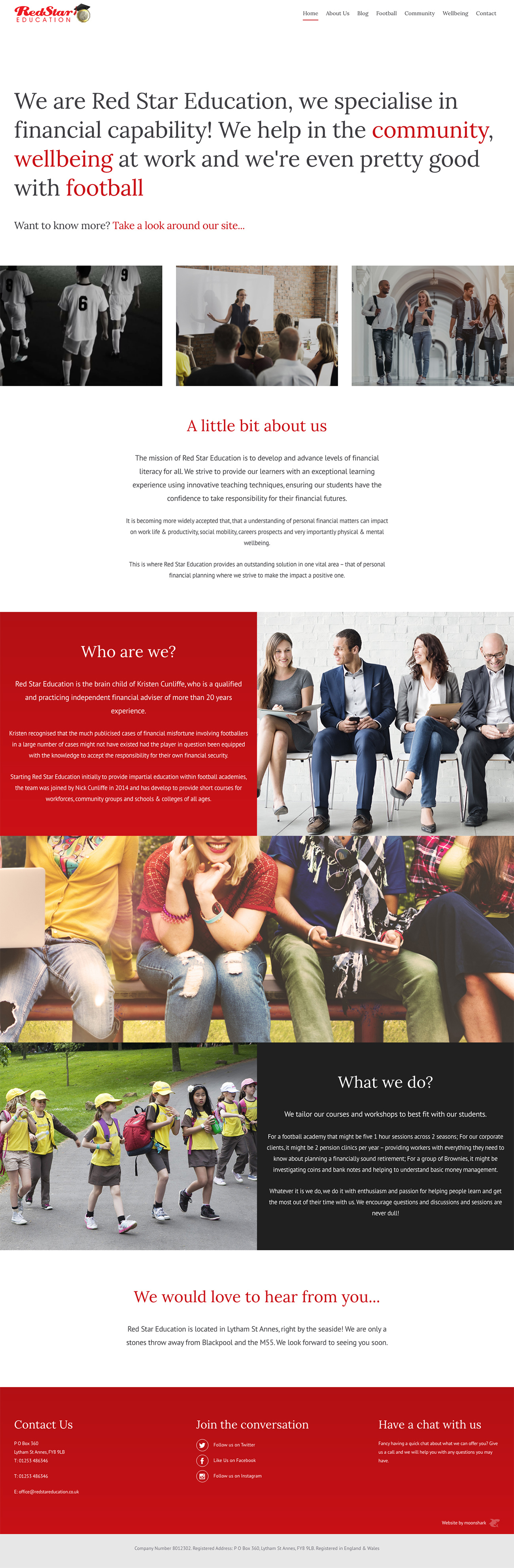
The final result
Below is the final result of the homepage. When I sent over the final result to Kristen she was very pleased and impressed with how I was able to realise her vision for the website. She loved how easy it was for the user to decide which part of the company that they wanted to read about via a simplistic user journey and how I was able to utilise the existing pages into the website to create a budget friendly site which lends itself to the overall Red Star Brand.
Retrospective
I enjoyed working on this as it was a challenge to create a way to send users to each area of the business without it looking like a splash screen from years ago. I believe I managed to do this successfully. I think if I was to build this website from the beginning I would have made sure that the whole website was built within the CMS, which would have allowed the client full editing capabilities across the whole site.

His work is exceptional and he's a top bloke which also helps! Pleasure to deal with - wouldn't use anyone else