The company
Cruise Club UK are a successful cruise booking agent who have been established for over thirty years providing the full cruise experience, from first-timers to seasoned cruisers.
Their main method of advertising was through sending out promotional leaflets and banners to previous cruise guests.
They quickly acknowledged they needed to focus on building their online presence to allow them to reach a wider audience as the website was providing little to no revenue.
The director of the company, Paul Edge got in touch with me and asked if I could help update and improve the website for him. I arranged a meeting with Paul so I could understand his goals for the website and the best way to achieve those objectives.
(Please note, this website may have changed since the point of handover as this is now managed in-house.)
The Problem
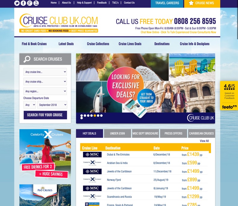
- The website was dated and did not work responsively making it difficult for users who visited the website on a smartphone or tablet.
- The homepage was full of different offers and call to actions which made for a very chaotic and distracting page making the whole experience cumbersome and off-putting to users.
- Their primary method of marketing was sending out magazines each month to previous customers to book again. They wanted to attract new customers to their website and modernise their outdated marketing strategy .
- The process of finding a cruise and the booking journey was clunky and needed to be simplified via an option to do an advanced search from the homepage.
- The cruise information page that users view to find out more information about individual cruises, such as the activities on board, the destinations and the day to day itinerary was not presented in an easy readable format.
- The pages were not laid out in a logical way meaning there was no real user journey. For example if you were viewing a potential destination, there would be no way of booking a cruise to that area easily.
The Requirements
- Improve the mobile and tablet experience for users as the current site was desktop only. Google analytics showed that a vast majority of visitors were using smartphones and tablets to view the site, but the bounce rate was very high and the time on page was low.
- To make searching for a cruise easier directly on the homepage via a prominent search feature.
- Educate both regular and first time cruisers about different locations and cruise liners available and improving the cruise information by revising how the destinations and full itinerary of a cruise is displayed for easy reading.
- Show listings of different types of offers that have to appear within a tabular layout.
- Make sure promotional banners are close to the top of the page so the user can easily see them encouraging users to click.
- Improve the booking pages, these particular pages did not have the same look and feel as the rest of the site and did not feel consistent with the branding.
- Improve the destination pages to showcase to potential customers what they can experience with one of Cruise Clubs cruise packages.
- To be able to use the current CMS that majority of UK cruise companies share to pull in pricing data without compromising on design.

My process
The first thing I did was carry out some user research by interviewing a few seasoned cruisers who spend a lot of time looking online for the best cruise offers available. I wanted to understand as regular users of cruise websites what they liked and disliked about the website and why in order to identify current problems so I could work towards designing with the user in mind.
I was told that they were recipients of the Cruise Club brochures, but found the website hard to use which made them less inclined to use it in comparison to other cruise websites. I also discussed what was most important when searching for a cruise and searching by cruise company and the latest offers were priority.
I then looked at some of Cruise Club's competitors to understand how other cruise companies were presenting themselves online, paying particular attention to the user journey. I also took a look at the CMS I was required to use, many cruise companies across the UK use the same system for pulling in pricing data which meant that I had to work with some restrictions such as various snippets of code that I was unable to edit. Part of the challenge of this project was to work with the current system whilst still being able to achieve the project objectives without compromising on the design.
I used the research information I had gathered and started to sketch some ideas. I wanted to find a way to show lots of offers without overpowering the user too much. Other considerations were users age,demographic and expected browsing habits.
Using the sketches I started to create some wireframes of the homepage, destination page, cruise information page and booking process. I then moved over to Sketch and started to design the pages and components that I would eventually build.
I sent these designs over to Paul using InVision for his feedback. Using InVision was really helpful in helping to create the client's vision with plenty of opportunity for feedback and open discussion allowing me to ensure all the key requirements would be covered before moving into the build phase.
Once Paul had approved all of the initial designs I then started to build the site and we had review meetings throughout the process to maintain client engagement.
The final result
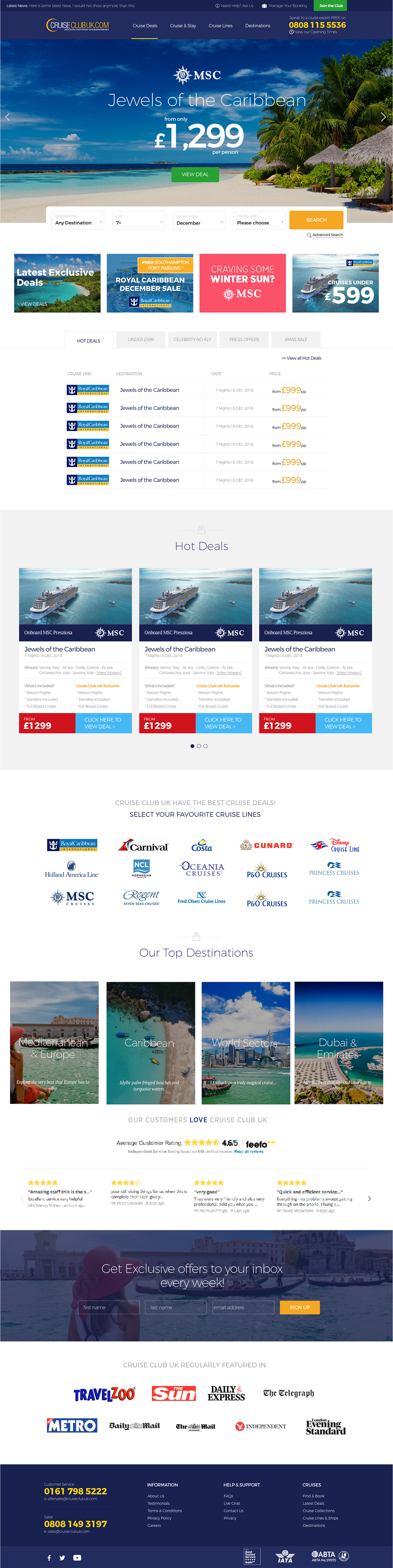
In comparison to the before design a number of changes have been made making for a much better user experience.
Some key differences are:
- I created carousels which allowed them to show lots of offers without them being too overpowering to the user.
- I put the promotional banners just below the homepage hero so the user can see these as soon as they scroll.
- I put the list of cruise offers within tabs so you can easily select a category, such as Hot Deals, Under £599 and No Fly.
- I added in logos of the companies that feature CruiseClub UK as this would give the user confidence that they are a reliable company and also made sure their Feefo rating was a feature.
- I moved the booking bar to fit full width of the screen and and made sure that this was available without the need to scroll.
- I created a destination section by using nice imagery and some "teaser" text, allowing users to click further if they wished.
- I changed the main options in the search, as the existing fields were aimed at experienced cruisers, which may confuse people who have never been on a cruise before. I chose - destination, date and cruise line as from my research these options were the most relevant and would help to simplify the search for first time cruisers. I moved the rest of the options within an advanced search, this would allow the user, if they felt comfortable to filter down even further to refine the results.
- I created a section on the homepage which showed all of the most popular cruise liners with their logo and a link through to a page with cruises only from that cruise line.
- I helped make the booking journey look as though it was part of the website and formatted it in a more natural way.
I am very happy with the outcome and most importantly so was the client. The website is now being maintained by their in house graphic designer, so some of these elements will have changed since the initial build.
Retrospective
This is the biggest freelance project that I have taken on and as a result was a valuable learning experience. One of the challenges was the tight deadline which meant that good communication was paramount. Paul was a great client and was always quick to respond to me and was open to calls and meetings whenever they were needed. I would have liked to be able to conduct additional research however time was limited.
Like any project there were some lessons learnt which I will take with me on future builds.

Chris carried out a full redesign of our website. He was always very professional. I would definitely recommend him.